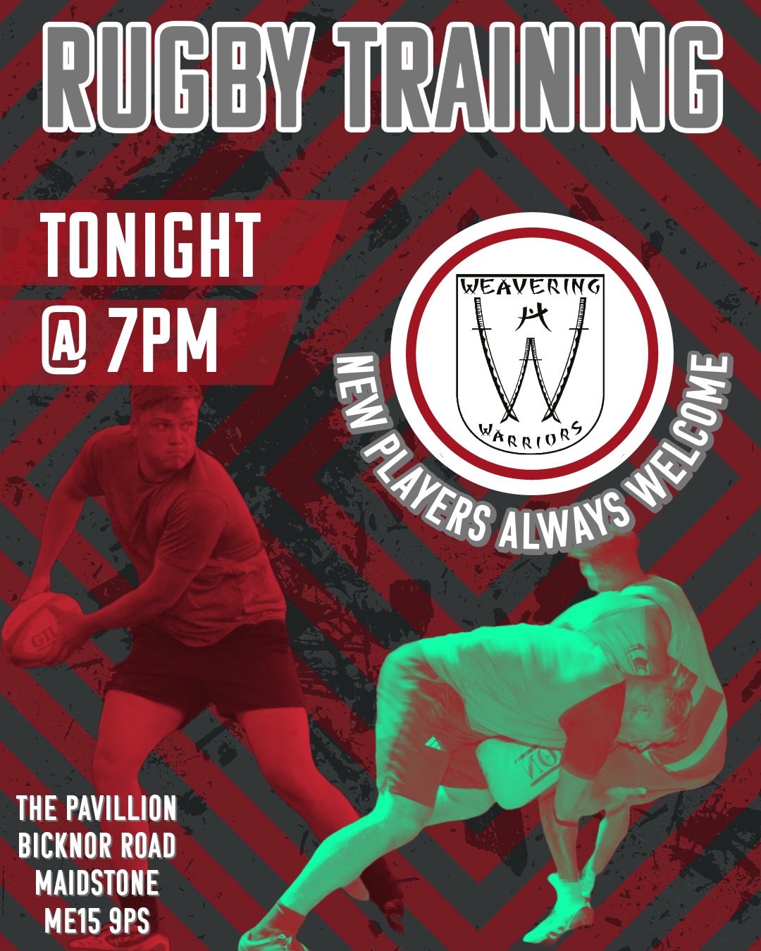
When designing this promotional poster for Weavering Warriors Rugby Club, the primary goal was to create an eye-catching and engaging visual that would not only inform but also excite potential players about the upcoming training session. I focused on strong typography, bold contrast, and dynamic imagery to capture the energy and intensity of rugby while maintaining the club’s branding.
By incorporating the club’s colours, logo, and action shots of players in motion, the design delivers a compelling call to action. The layout ensures that key details—date, time, and location—are highly visible, making it easy for viewers to understand at a glance.
Client Brief
The key requirements provided by the client included:
- Clear, Bold Announcement: The poster should instantly communicate the purpose—rugby training—using strong, attention-grabbing text.
- Incorporate Club Identity: The design should align with Weavering Warriors’ branding, using their colours, logo, and visual style.
- Encourage New Players: A welcoming message should be included to highlight that new players are always welcome.
- High-Impact Imagery: The use of rugby action shots was essential to convey energy and excitement.
- Essential Information Clarity: The date, time, and location must be prominent and easy to read.
Design Iteration & Final Delivery
To ensure the best outcome, I followed a structured design process:
- Concept Development:
- Gathered references and analysed other sports posters to identify effective design trends.
- Chose a colour scheme that aligns with the club’s branding while ensuring high contrast for readability.
- First Draft:
- Created an initial composition featuring a mix of bold typography and player imagery.
- Experimented with different placements of text and visuals to find a balanced layout.
- Client Feedback & Adjustments:
- Presented the draft to the client and received feedback on font size, text placement, and image selection.
- Adjusted the emphasis on key details (e.g., making the time and location more prominent).
- Tweaked the effects on images, ensuring the action shots stood out without overpowering the text.
- Final Refinements:
- Enhanced the background with a subtle texture and club-themed chevron pattern for added depth.
- Finalised the typography to ensure readability across different viewing platforms (print, social media, mobile).
- Delivered the poster in multiple formats for versatility in print and digital use.
The result is a visually striking poster that meets all client objectives—clear messaging, club branding, and an energetic feel that encourages participation.
