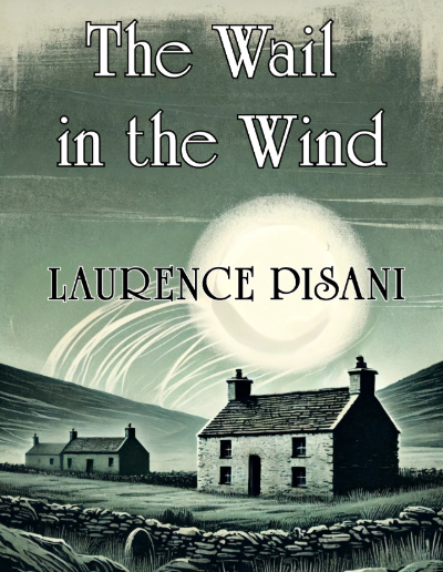
The cover for The Wail in the Wind was designed to evoke a sense of mystery, isolation, and the eerie beauty of folklore. The monochromatic, misty green palette sets the tone for a story that is both haunting and atmospheric, drawing the reader into its world of windswept landscapes, eerie silence, and lingering spirits.
The central glowing orb, reminiscent of a supernatural moon or an ethereal presence, enhances the feeling of otherworldliness, while the lone stone cottage, set against rolling hills and turbulent skies, creates a sense of solitude, history, and the unknown. The typography complements the gothic yet timeless aesthetic, reinforcing the novel’s themes of mysticism, folklore, and the forces that linger beyond the physical realm.
Client Brief Highlights
- Capture an Atmospheric, Haunting Aesthetic: The cover needed to reflect the novel’s eerie and folklore-inspired themes.
- Minimal Yet Impactful Composition: The design had to be simple yet evocative, drawing readers in with its visual storytelling.
- Symbolism of the Supernatural: The glowing orb suggests a spiritual presence, an omen, or a force beyond human understanding.
- Traditional Yet Timeless Typography: The font choice had to reflect both the historical setting and the haunting nature of the narrative.
- Muted, Monochromatic Colour Scheme: A balance of deep shadows and ghostly highlights to reinforce the novel’s brooding and melancholic tone.
Design Iteration & Final Delivery
To create a visually arresting yet understated cover, the process included:
- Concept Exploration:
- Researched traditional gothic, folklore, and supernatural themes in book cover design.
- Sketched potential compositions that balanced solitude, supernatural elements, and atmospheric storytelling.
- First Design Drafts:
- Developed multiple colour palettes, experimenting with different shades of green, grey, and muted earth tones.
- Explored different moonlight and mist effects to create an ethereal glow.
- Client Feedback & Refinements:
- Adjusted the glowing orb’s brightness and positioning to make it feel more mysterious.
- Refined textures and shading on the cottage and landscape to add depth.
- Fine-tuned the typography style and placement for better readability and integration with the design.
- Finalisation & Print Optimisation:
- Ensured high-resolution quality for paperback and eBook formats.
- Delivered files in multiple formats for different marketing and promotional needs.
- Balanced contrast and details to maintain impact across print and digital versions.
The finished cover for The Wail in the Wind is an evocative, haunting visual that captures the novel’s essence of mystery, folklore, and the supernatural. The moody atmosphere, timeless typography, and ghostly glow create an unforgettable first impression, drawing readers into a tale of whispers carried by the wind.