This promotional booklet was designed to educate, engage, and inspire individuals about the Sovereign Hospitaller Order of St. John of Jerusalem (SHOSJ). The goal was to create a visually compelling and informative piece that highlights the Order’s history, mission, and activities while maintaining an elegant and professional aesthetic.
By combining historical symbolism, strong typography, and a structured layout, the booklet ensures that key information is both accessible and visually appealing. The use of the Order’s official colours, heraldic elements, and the Maltese Cross reinforces tradition and heritage, while the layout allows for easy readability and engagement.
Client Brief Highlights
The booklet was required to:
- Maintain a Formal and Traditional Aesthetic: The design had to reflect the prestige and historical significance of the Order.
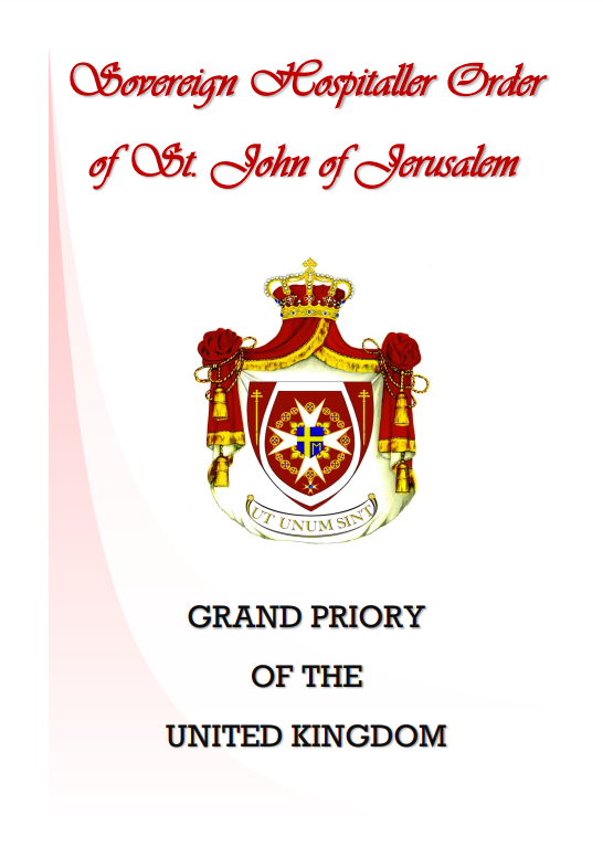
- Feature the Order’s Branding Elements: The crest, Maltese Cross, and red-and-white colour scheme were essential to reinforce identity.
- Ensure Readability and Accessibility: The content needed to be structured in a way that makes it easy to follow and engaging.
- Include a Balance of Text and Imagery: A mix of historical information, modern activities, and imagery was necessary to showcase the Order’s ongoing impact.
- Encourage Engagement and Contact: The final pages needed to include a clear call to action for those interested in learning more or joining.
Design Iteration & Final Delivery
To create a polished and effective promotional booklet, the process included:
- Concept Development:
- Researched traditional designs used by knightly and hospitaller orders to maintain historical accuracy.
- Created a visual framework that balanced heritage with modern readability.
- First Drafts:
- Developed multiple layouts with different text and image placements.
- Experimented with font pairings to ensure a classic yet clean aesthetic.
- Adjusted the background elements to add subtle depth without overpowering content.
- Client Feedback & Refinements:
- Adjusted text size and spacing for improved readability.
- Enhanced image placement to ensure a cohesive visual flow.
- Refined the colour balance to maintain a regal yet modern look.
- Finalisation & Print Production:
- Prepared high-resolution print-ready files for professional printing.
- Ensured digital versions were optimised for sharing via email and online platforms.
- Delivered the booklet in multiple formats (PDF, print-ready, and digital-friendly versions).
The completed booklet serves as a timeless and authoritative piece of promotional material for the Grand Priory of the United Kingdom. It successfully conveys the Order’s heritage, values, and modern activities, making it an effective tool for outreach, education, and recruitment.