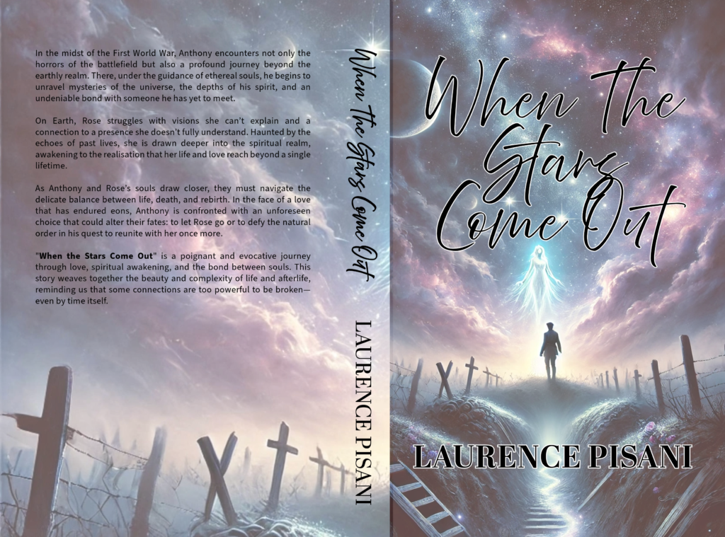
The cover design for When The Stars Come Out was crafted to reflect the novel’s ethereal, emotional, and transcendental themes. The imagery blends the brutality of World War I with the mysticism of the afterlife, creating a striking visual that captures the story’s balance between life, death, and spiritual awakening.
The composition draws the viewer in with a haunting yet beautiful battlefield scene, transitioning into a celestial, otherworldly space where a glowing spirit and a lone soldier stand at the threshold of two realms. The typography is flowing and elegant, reinforcing the novel’s themes of love, fate, and the timeless connection between souls.
Client Brief Highlights
- Capture the Story’s Duality: The cover needed to reflect both the harsh reality of war and the beauty of the afterlife, seamlessly transitioning between the two.
- Evoke a Sense of Mystery & Emotion: The imagery should hint at the profound journey of the protagonists, balancing spirituality and historical fiction.
- Use Symbolic Visual Elements: The glowing ethereal figure, war-torn graves, and the soldier’s solitary stance all represent key moments and themes in the book.
- Typography to Match the Mood: The title font had to feel whimsical yet bold, reflecting the romantic and otherworldly nature of the story.
- A Colour Palette of Contrast & Harmony: Soft celestial blues and purples juxtaposed with the muted, sombre battlefield tones enhance the book’s themes of transformation and hope.
Design Iteration & Final Delivery
To ensure the perfect visual representation of the story, the process included:
- Concept Development:
- Explored historical and fantasy cover inspirations to find a unique blend of both styles.
- Sketched different scene compositions to balance the earthly and spiritual elements.
- First Design Drafts:
- Created multiple layout variations with different sky transitions, character placements, and lighting effects.
- Experimented with the glow and transparency of the ethereal figure to achieve the right mystical feel.
- Client Feedback & Refinements:
- Adjusted the placement of the soldier and spirit for stronger emotional impact.
- Enhanced the sky gradient and celestial elements to make the transition more seamless.
- Refined the font choices and positioning for readability and elegance.
- Finalisation & Print Optimisation:
- Ensured high-resolution quality for paperback printing.
- Delivered files in multiple formats for print and digital promotion.
- Adjusted contrast and lighting to maintain visual impact across different media.
The finished cover for When The Stars Come Out is a captivating blend of historical fiction and spiritual fantasy, drawing the reader into its world of war, love, and the mysteries of the afterlife. The ethereal glow, dreamlike typography, and symbolic imagery make it an unforgettable first impression of the novel.